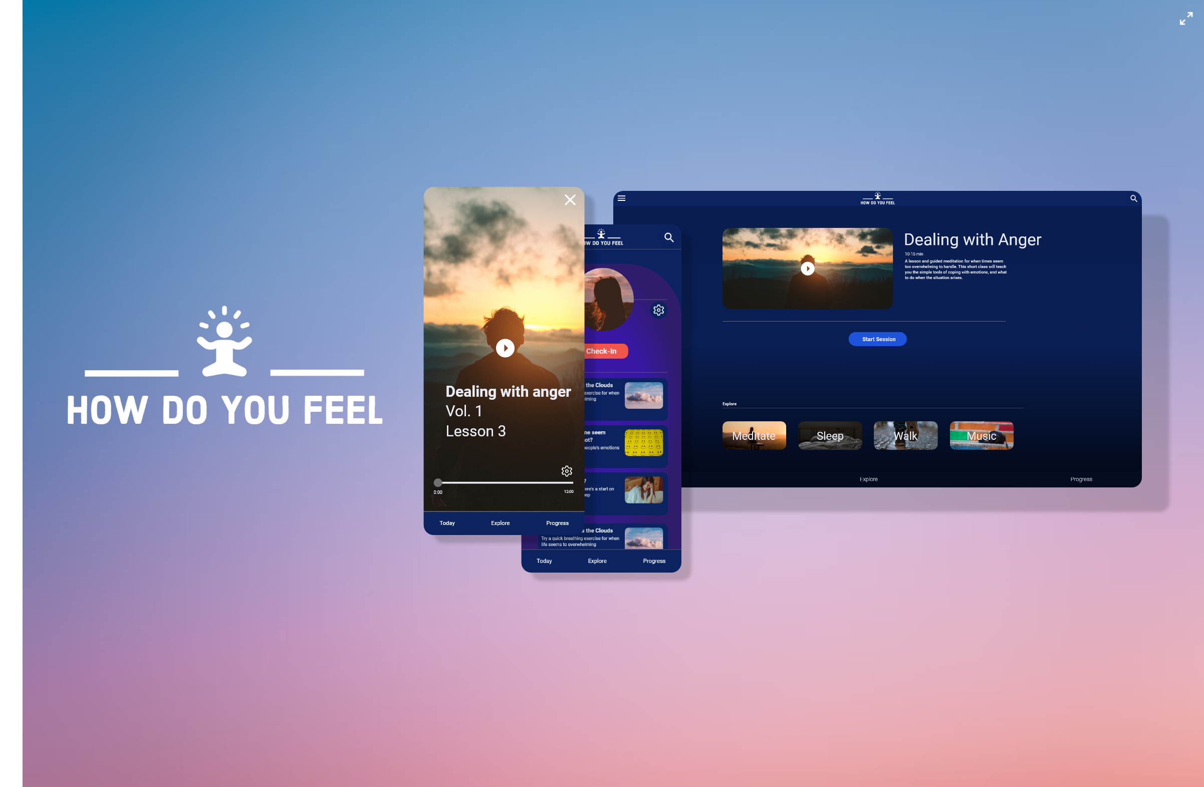
‘How Do You Feel’ is focused on the mental and emotional wellbeing of kids, and young adults struggling to understand themselves, and their emotions.
Coming from a background where I felt like I didn’t know to control my emotions properly, I can empathize with the younger generation trying to do so.
From smalls tasks, and little steps at a time, we are able to make a huge difference on the way we react to difficult emotions. ‘How Do You Feel?’ is intended to help with that.
The Problem
The Solution
An increasing issue with our youth is mental health. With the ever growing wave of technology, mental health is declining.
Research has indicated that internet addiction, particularly among younger demographics such as teenagers, is becoming a widespread issue. It has been linked to depression, low self-esteem, and loneliness – symptoms that often lead to diagnosable mental illnesses and worsening issues that were already present
Create a healthy way for kids and young adults to journal their emotions, and learn healthy ways to cope with difficult feelings, such as anger, sadness, and resentment.
The Goal
Finding ways to express our feelings, but also understand them. Expressing yourself can help you keep in touch with how you are feeling. It can also help you release a lot of tension that you might be carrying around. Sometimes, when people lose touch with how they feel, their feelings burst out in situations or ways that are embarrassing or inappropriate.
Empathize
Before ideating on my design, I needed to clarify a few things such as,
Who is my user? What is the main demographic? What are their motivations and behavior? What does their journey look like?
These are all important questions to be answered prior to ideation. While putting the user first and center, we also create more empathy for them.
Competitive Analysis
Personas
I wanted to identify and evaluate the key usability strengths and weaknesses of my competitors, and see what I could improve upon.
The main competitor that I looked at for this project was Headspace.
Although they have a great UX, as a prior user of their app, I know what they did well, but I also noticed some key features that could be improved upon.
Ideation
I used a dark background and a clean Roboto font. This gives the reader great readability as it reduces eye strain.
A dark mode background would cause the pupils to constrict less and stay dilated. As a result, users can focus better without experiencing visual fatigue. This being a meditation app, it is crucial for me that usersfeel comfortable at all times while navigating ‘How Do You Feel?’
The land between Ideation and Prototype
Between the ideation and the prototype, I wanted to think about the branding, and why I would go one direction or the other.
I wanted the user to be greeted by the Daily Check-in on the home screen, rather than having to look for this feature elsewhere.
When conducting my competitive analysis, I noticed that Headspace only offers check-ins on a monthly basis. For my application, I felt that having a daily check-in would be more suitable for my user base.
Prototype
Going through each step of the process as a user was crucially important to understand the main user flow, and what actions should be emphasized.
Mobile Prototype
Mobile Prototype - 'How Do You Feel?'
Web Prototype
Web Prototype - 'How Do You Feel?'
Takeaways
-
Objective
Focusing on the user, and the reason why this design is being done is the most important goal. I should have focused more on the age demographic that this design was intended to, and put more thought into the ideation phase of this design.
-
Consistency
An issue that I had when I first began designing this was that I lacked consistency, and each screen looked like it was for a different design. Having consistency is key.
-
Focus
It’s easy to only think of how a design looks, but it is equally important, or more, to think of your user interacting with your product, and how the feel and flow is in action.


